Data Analysis Exercise
Part One
PART ONE: ONE
 |
|
The
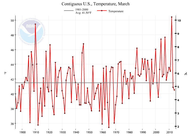
time series graph for April shows an interesting, but expected trend. From
the start of this graph in 1895 to present day, the temperatures for March have
shown a steady increase. This increase is especially noticeable starting around
the mid-1970’s to present day. Compared to last year, we are rather close to
the same. Compared to the norm, this year is slightly below the average at
about 41°F.
|
 |
| This time-series chart from Wisconsin for January-March shows many of the same trends as the first chart. Around the start of the 1980's, a noticeable, gradual increase in temperatures started to occur. |
 |
| This time-series chart for precipitation trends in Wisconsin for January-March. I was not able to pick out much of a change in trends for this chart, but it does seem like there are a few examples of the extremes being more extreme. Sometime in the late 1990s, the highest precipitation values was recorded for the months of January-March, at 7 inches. |
 |
| This map looks at the regional precipitation rankings from 1895-2014 for the month of March. In that timespan, three regions stick out as being below average for precipitation, including the Midwest. One region is recorded as much above average, which is the region of the Pacific Northwest. |
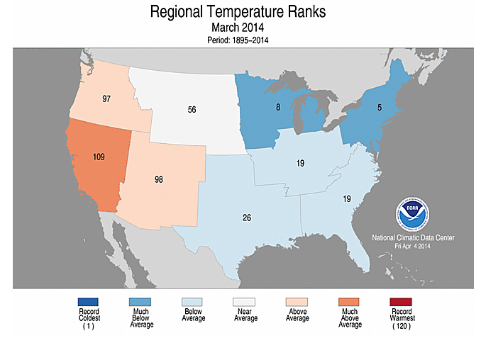 |
| This shows the regional temperature rankings from 1895-2014 for the month of March. Aside from being below average for precipitation, the Midwest is also much below average temperatures. The New England area also is recorded as being much below average. The Pacific Northwest and Desert Southwest are above average temperatures. The southeast, South, and Rust Belt regions are below average temperatures as well. The Pacific Southwest is much above average temperatures, as we have seen this year as their crippling drought continues. |
Rank
|
Top
Ten Warmest
|
Top
Ten Coldest
|
1
|
2012
|
1917
|
2
|
1998
|
1904
|
3
|
1931
|
1950
|
4
|
1987
|
1924
|
5
|
2006
|
1951
|
6
|
1999
|
1912
|
7
|
1921
|
1929
|
8
|
2005
|
1972
|
9
|
2001
|
1907
|
10
|
2010
|
1979
|
The
information in letter a-f show that, while temperatures have not jumped up by
10°F, they have increased by a few degrees, noticeably, over the last 40 years.
It relates to the current debates about climate change because it shows that,
over a 118 year period, temperatures on national and regional scales are rising
slightly. The tabular data shows that 5/10 warmest years on record for the
Upper Midwest region occurred after 2000. Other data that could be used to see
if global climates are changing are data from around the world to see if the
trend is global, sea-level data over the last 100+ years, global drought
conditions, and maybe even documentation of elevation range changes for species
to determine if they are being pushed towards more familiar climates and climbing
in elevation. Unfortunately, all the data that every compiled can be made
available, but there are still a large number of people who do not believe in
climate change, as well as a large number of people who do not take the
initiative to educate themselves on the matter.
Value
|
Rank
|
Anomaly
|
|
191712
|
38.8
|
1
|
-4.2
|
190412
|
40.1
|
2
|
-2.9
|
195012
|
40.2
|
3
|
-2.8
|
192412
|
40.5
|
4
|
-2.5
|
195112
|
40.6
|
5
|
-2.4
|
191212
|
40.7
|
6
|
-2.3
|
192912
|
40.7
|
7
|
-2.3
|
197212
|
40.9
|
8
|
-2.1
|
190712
|
41
|
9
|
-2
|
197912
|
41.1
|
10
|
-1.9
|
199612
|
41.1
|
11
|
-1.9
|
191612
|
41.2
|
12
|
-1.8
|
192612
|
41.4
|
13
|
-1.6
|
190312
|
41.5
|
14
|
-1.5
|
189512
|
41.6
|
15
|
-1.4
|
197812
|
41.6
|
16
|
-1.4
|
189912
|
41.7
|
17
|
-1.3
|
193612
|
41.7
|
18
|
-1.3
|
190512
|
41.8
|
19
|
-1.2
|
193712
|
41.9
|
20
|
-1.1
|
196512
|
41.9
|
21
|
-1.1
|
196712
|
41.9
|
22
|
-1.1
|
189712
|
42
|
23
|
-1
|
190912
|
42
|
24
|
-1
|
194312
|
42
|
25
|
-1
|
194512
|
42
|
26
|
-1
|
198512
|
42
|
27
|
-1
|
198912
|
42
|
28
|
-1
|
199312
|
42
|
29
|
-1
|
196612
|
42.1
|
30
|
-0.9
|
198212
|
42.1
|
31
|
-0.9
|
194012
|
42.2
|
32
|
-0.8
|
192712
|
42.3
|
33
|
-0.7
|
196912
|
42.3
|
34
|
-0.7
|
192012
|
42.4
|
35
|
-0.6
|
196212
|
42.4
|
36
|
-0.6
|
200812
|
42.4
|
37
|
-0.6
|
189612
|
42.5
|
38
|
-0.5
|
193512
|
42.5
|
39
|
-0.5
|
196012
|
42.5
|
40
|
-0.5
|
197012
|
42.5
|
41
|
-0.5
|
191512
|
42.6
|
42
|
-0.4
|
192512
|
42.6
|
43
|
-0.4
|
201312
|
42.6
|
44
|
-0.4
|
197612
|
42.7
|
45
|
-0.3
|
189812
|
42.8
|
46
|
-0.2
|
190212
|
42.8
|
47
|
-0.2
|
193212
|
42.8
|
48
|
-0.2
|
195812
|
42.8
|
49
|
-0.2
|
190112
|
42.9
|
50
|
-0.1
|
191412
|
42.9
|
51
|
-0.1
|
191812
|
42.9
|
52
|
-0.1
|
191912
|
42.9
|
53
|
-0.1
|
194712
|
42.9
|
54
|
-0.1
|
195612
|
42.9
|
55
|
-0.1
|
195912
|
42.9
|
56
|
-0.1
|
197112
|
42.9
|
57
|
-0.1
|
200912
|
42.9
|
58
|
-0.1
|
192312
|
43
|
59
|
0
|
195712
|
43
|
60
|
0
|
197412
|
43
|
61
|
0
|
190612
|
43.1
|
62
|
0.1
|
192812
|
43.1
|
63
|
0.1
|
198012
|
43.1
|
64
|
0.1
|
194812
|
43.2
|
65
|
0.2
|
196312
|
43.2
|
66
|
0.2
|
199712
|
43.2
|
67
|
0.2
|
191012
|
43.3
|
68
|
0.3
|
197512
|
43.3
|
69
|
0.3
|
199512
|
43.3
|
70
|
0.3
|
191112
|
43.4
|
71
|
0.4
|
196112
|
43.4
|
72
|
0.4
|
199212
|
43.4
|
73
|
0.4
|
191312
|
43.5
|
74
|
0.5
|
194212
|
43.5
|
75
|
0.5
|
196812
|
43.5
|
76
|
0.5
|
199412
|
43.5
|
77
|
0.5
|
195512
|
43.6
|
78
|
0.6
|
197712
|
43.8
|
79
|
0.8
|
198412
|
43.8
|
80
|
0.8
|
190012
|
43.9
|
81
|
0.9
|
193312
|
43.9
|
82
|
0.9
|
195212
|
43.9
|
83
|
0.9
|
200312
|
43.9
|
84
|
0.9
|
190812
|
44
|
85
|
1
|
192212
|
44
|
86
|
1
|
194912
|
44
|
87
|
1
|
195412
|
44
|
88
|
1
|
196412
|
44
|
89
|
1
|
198312
|
44
|
90
|
1
|
193012
|
44.1
|
91
|
1.1
|
198612
|
44.1
|
92
|
1.1
|
200412
|
44.1
|
93
|
1.1
|
193412
|
44.2
|
94
|
1.2
|
194412
|
44.2
|
95
|
1.2
|
198812
|
44.2
|
96
|
1.2
|
194612
|
44.3
|
97
|
1.3
|
193912
|
44.5
|
98
|
1.5
|
198112
|
44.5
|
99
|
1.5
|
200012
|
44.5
|
100
|
1.5
|
199112
|
44.6
|
101
|
1.6
|
201112
|
44.7
|
102
|
1.7
|
193812
|
44.8
|
103
|
1.8
|
195312
|
44.9
|
104
|
1.9
|
197312
|
44.9
|
105
|
1.9
|
200212
|
45
|
106
|
2
|
194112
|
45.2
|
107
|
2.2
|
199012
|
45.2
|
108
|
2.2
|
200712
|
45.2
|
109
|
2.2
|
201012
|
45.6
|
110
|
2.6
|
200112
|
45.7
|
111
|
2.7
|
200512
|
45.7
|
112
|
2.7
|
192112
|
46
|
113
|
3
|
199912
|
46
|
114
|
3
|
200612
|
46.7
|
115
|
3.7
|
198712
|
47.2
|
116
|
4.2
|
193112
|
47.5
|
117
|
4.5
|
199812
|
47.5
|
118
|
4.5
|
201212
|
47.9
|
119
|
4.9
|
PART ONE: TWO

Madison:
Minimum: January (16.0°F)
Maximum: July (71.0°F)
Milwaukee:
Minimum: January (18.9°F)
Maximum: July (70.9 °F)

Madison:
Minimum: January (1.1 in),
February (1.1 in)
Maximum: August (4.0 in)
Milwaukee:
Minimum: February (1.5 in)
Maximum: April (3.5 in), August
(3.5 in), September (3.5 in)
The temperature data shows what
would be expected when comparing the two cities. Milwaukee is right on a large
body of water, so it is warmer in the winter, because the temperature is warmed
by Lake Michigan. The summer temperature is very slightly cooler for Milwaukee,
which can also be attributed to the water cooling the surrounding areas. Milwaukee
is, on average, warmer than Madison in the winter and cooler than Madison in
the summer. For precipitation, another interesting trend emerged. Milwaukee did
not have the highest high amount of precipitation or the lowest low amount of
precipitation. Milwaukee did have the most precipitation, however, and had a
much smaller difference between the high and low months. Madison was much more
sporadic, having slightly less rainfall, higher highs, and lower lows.
PART ONE: THREE
Precipitation to
Date
|
||
City
|
Rainfall
|
Snowfall
|
Minneapolis
|
1.84
|
7.0
|
Eau Claire
|
2.67
|
9.1
|
La Crosse
|
No Records Available
|
No Records Available
|
Eau Claire has more rainfall
precipitation and snowfall than Minneapolis. Both Minneapolis and Eau Claire
get their data from a station in Chanhassen, MN. Since Minneapolis is much
closer to Chanhassen, the reports are most likely much more precise than those
in Eau Claire, as the station would have to make estimates for what the values
will be when they reach Eau Claire.
PART ONE: FOUR
The data mostly spans from
1961-1990, so it is dated and not able to properly the current climate
situations that we are currently experiencing. The difference in the data is
for the initial average rainfall data, which looks at 1949-1995, a forty-five year
span, versus the other data, which looks at a thirty-year span. So the data is
dated and inconsistent when it comes to measuring methods.
 |
| This climograph for Eau Claire shows that the highest average temperatures and precipitation both peak in mid-summer. There is a slight decrease in precipitation in July, which coincides with the hottest average temperatures. |
 |
| This climograph for Minneapolis shows that the highest average temperatures occur just after the highest average precipitation. June, while being the third hottest month, sees the most precipitation, while July and August see a slight drop in precipitation before it tapers off, steadily. |
 |
| This climograph for La Crosse shows that the highest average precipitation is quite steady for roughly four months, from June-September, before tapering off. There is a slight dip, coinciding with the highest average temperature in July. |
 |
| This climograph for Madison shows two spikes in precipitation in June and August, and a sharp drop during the hottest month of the year, July. |
 |
| This climograph for Milwaukee shows a very large increase in precipitation from February-April, most likely coinciding with the thaw of the Great Lakes, particularly Lake Michigan, allowing for increased moisture content in the air. There is no dip in average precipitation coinciding with July, the hottest month, as in most other cities viewed. |
 |
| This climograph for Superior shows a moderate decline in precipitation during the hottest month of the year, July. The average precipitation peaks in August and stays rather high for September as well, though the temperature drops off. |
 |
| This climograph for Wausau shows the drop in precipitation during the hottest part of the year, July. The precipitation peaks in August and stays almost the same level for September. |
PART ONE: FIVE
When
comparing data to more than one location, the ability to gain a comprehensive
view of an area is possible. If one looks at Minneapolis, their idea may be
skewed because the temperatures in Minneapolis are slightly warmer than the
surrounding areas due to the urban heat island effect. Small local differences,
such as this, are why a comprehensive view of an area can only be gathered when
looking at more than one location.
PART ONE: SIX
As
stated before, local differences can have a big affect on the averages, raising
or lowering them, depending on the region. Lake Effect, Urban Heat Island,
Windward/Leeward Positions, and a number of other things can affect the
temperatures and precipitation totals.
PART ONE: SEVEN
The
various techniques used can also have a big effect. The number of years that are
observed, how recent the data is, the equipment used, how regular the recording
is, and a number of other things will affect the data. If data is recorded
every once in a while, at non-regular intervals, it will be more easily skewed
then the opposite. Old data will not be as useful if trying to determine local
climates, because the data has changed significantly in recent years.
PART TWO
 |
| This line graph for January temperatures from 2013 shows the ability for fluctuations that can occur, most likely coinciding with the subpolar jet stream meandering, bringing cold arctic and polar air down. |
 |
| This line graph for February temperatures from 2013 shows the effect of the subpolar jet as well. There are very large fluctuations in the temperatures in this chart as well, though we start to see less fluctuating around Feb. 22, where temperatures begin to stay closer together. |
 |
| This line graph for March temperatures from 2013 shows that there can still be some lapses back to cold temperatures, but no temperatures in this graph dipped into the subzero range. At the very end of the graph, temperatures are starting to consistently climb. It should be noted that no data was collected for March 10, 2013. |
 |
| This line graph for April temperatures from 2013 shows even less of a fluctuation between low and high temperatures recorded. There is almost a constant steady incline as the month progresses, when the effects of the subpolar jet are less and less noticeable. |
 |
| This climograph for January temperature and precipitation shows a potential trend. Rising temperature peaks seem to coincide with precipitation. This would make sense, as warmer temperatures would most likely coincide with smaller dewpoint depressions and more moisture in the air. These storms would most likely be Alberta Clippers, which is guessed because of the drastic drop in temperatures preceding the precipitation events, which in this case would be snow. This is a pattern consistent with an Alberta Clipper. |
 |
| The trend for January can be noticed in February. Periods of precipitation are followed by drops in temperature. The precipitation events in February are much smaller than those of January for this year. |
 |
| Once again, the trend can be noticed for March that was true in January and February. A difference does exist though. The temperatures are consistently much warmer for this month, so the precipitation events have the capacity to be much larger, as seen towards the end of March. |
 |
| Finally, the April Climograph shows a different trend altogether. The temperatures are much more consistent and there does not seem to be a correlation between temperature drops and precipitation events. There may be slightly, but it does not seem to be great enough to be noticeable. Average temperatures barely get out from between the 30-40°F. It does climb quite substantially towards the end of the month, as the effects of the subpolar jet are very weak. |
 |
| The most dominant wind directions for January range from West-Southwest to West-Northwest, taking up 18 out of the 31 days of the month. An interesting trend is noticed when looking at the wind direction data when compared to the precipitation events. There seems to consistently be a switch to easterly winds, preceding a precipitation event. This is not always the case, but did seem to be a correlating factor. |
 |
| As in January, February sees most of its winds out of the western directions. In February, it seems as though the trend of easterly winds and precipitation is less noticeable, however there are relatively few precipitation events in February to start with, so it is difficult to determine. |
 |
| West winds dominate March, though the East-Southeast wind also had a large effect on the month. A number of precipitation events preceded or coincided with easterly winds, however it was when precipitation events coincided with west winds that a change was noticed. The few times in March and the few times in April that coincided with precipitation and westerly winds also coincided with large precipitation events. |
 |
| Winds for April seemed to switching constantly between east and west. This would make sense, as an increase precipitation would mean an increased number of low pressure systems rolling through the area. Winds would be switching from east to west and the different systems rolled through, depending on whether they went north or south of us. |
No comments:
Post a Comment